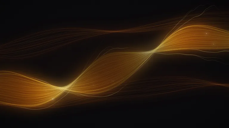
Flowing Lines Loop
BackgroundsThin flowing lines drift across a light background like wind over silk and part around a calm space for your title, looping seamlessly every 10 seconds
This is the format it was composed for. Switch above to see it lay itself out for another: same animation, re-arranged for the frame.
What you can change · 8 settings
Everything below can be changed without touching the animation. Hand the list to an agent, or edit the values at the bottom of the component file.
- Brandbrand · string
Brand colour set, one of the keys of BRANDS. The light brands (paper, press, field, linen, sky, frost) give the airy look this was designed for; a dark brand turns the same lines into glowing threads.
now: paper
- Colorscolors · array
Your own colours as hex strings; empty uses the brand's accent colours. The first leads the main family of lines, the second is the colour it fades to, the third and fourth tint the crossing family and the faint far layer. Any you leave out are made from the first colour and the brand.
now: 0 items
- Speedspeed · "slow" | "normal" | "fast"
How fast the lines flow. Each step is a whole-number multiple of the base motion (1x, 2x, 3x), which is what keeps the 10 second loop seamless. 'slow' suits a talking head or a long read, 'fast' a short intro.
now: normal
- Graingrain · number
Paper grain over the frame, 0 to 1. It stops soft tints banding after YouTube or Instagram compress the video. 0.35 is felt rather than seen; 0 for a perfectly clean frame.
now: 0.35
- Safe areasafeArea · "center" | "left" | "none"
Where your text will sit. 'center' makes the lines part around the middle of the frame like wind around a stone, 'left' opens the left third for a left-aligned title, 'none' lets them run full-bleed with no calm space.
now: center
- Vignettevignette · number
A soft shade toward the corners, 0 to 1. Kept gentle on light brands so the edges still match the paper; 0 for a perfectly even ground.
now: 0.3
- Lineslines · number
How many lines in total, shared across the three families. 40 to 80 is the designed range: around 45 is airy and minimal, 64 is the default, 80 and up reads as woven silk.
now: 64
- Thicknessthickness · number
Line weight. 1 is a fine line at any size or aspect ratio, still visible in a small thumbnail; 0.6 is a true hairline for full-screen use; 1.5 to 2 reads better on phones and small thumbnails; the heavier accent lines scale with it.
now: 1
For developers · source, dependencies and provenance
Dependencies
No Tailwind, no CSS, no asset files. Inline styles only.
Source
Provenance
Prompt
A flowing lines background like the Background Paths look everyone uses, but on a light ground: forty to eighty hairline curves sweeping across the frame in two or three families, drifting like wind or silk, the colour fading from teal to gold across each family and a few lines a little heavier for depth. It has to loop perfectly every ten seconds, leave a calm space in the middle for my title, and let me set how many lines there are and how thick they are.