Typewriter Captions
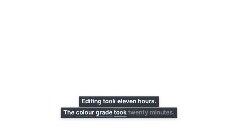
Titles & lower thirdsWord-timed captions typed letter by letter across each spoken word, in a mono face behind a block caret, on a plate that grows from a fixed margin
This is the format it was composed for. Switch above to see it lay itself out for another: same animation, re-arranged for the frame.
What you can change · 10 settings
Everything below can be changed without touching the animation. Hand the list to an agent, or edit the values at the bottom of the component file.
- Srtsrt · string
Paste an SRT or WebVTT file's text. When it has cues it replaces `words`, and the words inside each cue share its time in proportion to their length. A longer transcript types on for as long as the composition runs, so lengthen the composition to show all of it.
- Wordswords · array
The transcript as timed words, straight from any transcription tool that exports word timings. Each word types on letter by letter across its own start and end, so a word said slowly types slowly.
now: 21 items
- Max wordsmaxWords · number
The most words on one screen. A screen also ends at a full stop, a new subtitle cue or a pause longer than 0.6 seconds, and it clears the moment the next one starts. Six words take two lines at 16:9 and two or three on a vertical frame, the earlier lines rolling up as the next one types.
now: 6
- Emphasisemphasis · array
Words that type in the accent colour and a weight heavier, matched ignoring case and punctuation, so 'nine' also catches 'Nine,'. Give it the figures and names the sentence is about; the heavier weight moves nothing, because every letter is the same width.
now: 3 items
- Positionposition · "lower" | "center" | "upper"
Where the caption sits. 'lower' clears the player controls at 16:9, and on a vertical frame stays above the bottom 18% and left of the right-hand 12%, where the platform's own caption and buttons live. The typing line never moves, earlier lines roll up above it.
now: lower
- Scalescale · number
Type size. 1 sets about 90 px on a 1080p landscape frame and 77 px on a vertical one, sized to be read on a phone. If a word is too long for a line, or a screen needs more lines than fit, the whole transcript is set smaller rather than one screen.
now: 1
- Blinkblink · number
Frames in one caret blink while it waits between words: on for half, off for half, cut on whole frames the way a terminal cursor blinks. The caret stays solid while a word is typing, so short gaps inside a sentence never blink.
now: 18
- Stagestage · boolean
Draw the stand-in shot behind the caption, a soft-focus study desk with a laptop and notes, so the demo can be judged over real tone. It is set dressing and not part of the caption: switch it off when you lay this over your own video.
now: true
- Groundground · boolean
Paint a plain brand ground behind the caption when the stand-in is off. Off by default: this is an overlay, and with both off it renders on an alpha channel that drops straight onto your footage.
now: false
- Brandbrand · string
Brand token id, one of the keys of BRANDS. The caption is set in the brand's mono face on its surface colour, with emphasis in its accent. 'paper' is what the plate and the stand-in desk are drawn for.
now: paper
For developers · source, dependencies and provenance
Dependencies
No Tailwind, no CSS, no asset files. Inline styles only.
Source
Provenance
Prompt
I want my subtitles to look typed. Every word should type on letter by letter while I am actually saying it, with a solid block cursor in front of the letters like an old terminal, in a monospace font on a clean white caption box. I paste my SRT or the word timings from my transcript, it shows about six words at a time and clears for the next line, and the numbers I care about come up in my brand colour. It has to work on a normal landscape video and on a vertical short without hiding under the TikTok buttons, and it needs a transparent background so I can put it over my own footage.