Vertical Step Card
Titles & lower thirdsA warm paper step card for how-to Shorts: index tabs slide out of the page edge and the instruction resolves out of defocus
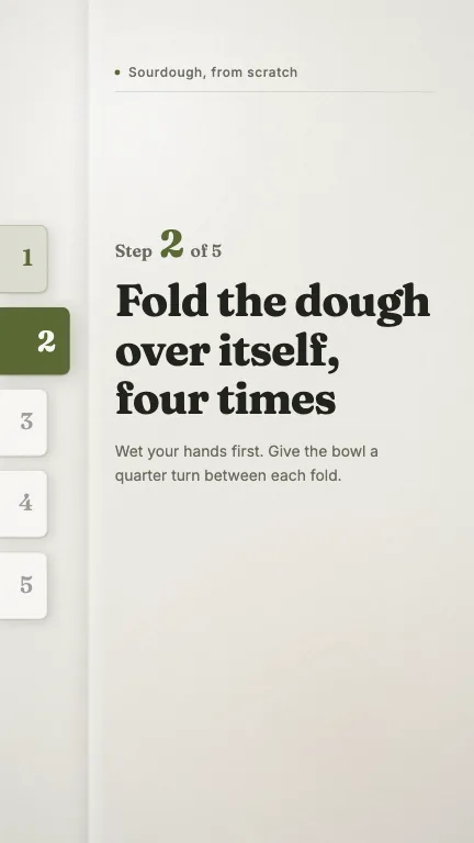
This is the format it was composed for. Switch above to see it lay itself out for another — same animation, re-arranged for the frame.
What you can change — 8 settings
Everything below can be changed without touching the animation. Hand the list to an agent, or edit the values at the bottom of the component file.
- Instruction *instruction · string
The step itself, in the imperative — 'Fold the dough over itself'. This is the largest thing in the frame and the only thing a viewer is guaranteed to read, so write the action and leave the caveats to `detail`. Four to eight words sets in two or three lines; the type scale drops automatically past forty-six characters and again past seventy-four, so a long instruction still fits but arrives smaller.
now: Fold the dough over itself, four times
- Stepstep · number
Which step this frame is. Clamped into `total`, and it decides which index tab is filled: the tabs above it read as done, the tabs below as still to come.
now: 2
- Totaltotal · number
How many steps the whole how-to has. Sets the number of index tabs down the left edge and the 'of N' in the step line. Tab height divides the fixed column, so seven tabs are thinner than three rather than taller — the spine never changes length.
now: 5
- Step labelstepLabel · string
The word before the number. 'Step' for a how-to, but 'Part', 'Tip', 'Day' or 'Round' all read naturally in this slot and retarget the component to a different series without touching anything else.
now: Step
- Kickerkicker · string
Running head at the top of the page — the name of the how-to, not of the step. Set in sentence case beside a small accent dot, with a hairline drawing under it. Omit it and the top of the frame stays bare paper.
now: Sourdough, from scratch
- Detaildetail · string
The quiet second line under the instruction: the caveat, the tell, the thing that makes the step work. One or two sentences. Omit it when the instruction is self-evident.
now: Wet your hands first. Give the bowl a quarter turn betwee…
- Creasecrease · boolean
Run a soft fold down the gutter between the tab spine and the text, so the frame reads as a page rather than a slide. Switch it off for a flatter, more modern sheet.
now: true
- Brandbrand · string
Brand token id — one of the keys of BRANDS. Written for `field`, whose warm off-white and olive are the whole point; `paper` and `press` also work. The dark palettes invert legibly but lose the reason this component exists.
now: field
For developers — source, dependencies and provenance
Dependencies
No Tailwind, no CSS, no asset files. Inline styles only.
Source
Provenance
Prompt
A 'Step 2 of 5' card for a how-to Short, and I want it to feel calm — warm paper, a serif, nothing technical. Down the left edge put index tabs like the dividers in a recipe box, one per step, sliding out from behind the page with the live one filled olive and pushed a little further out. The instruction itself should be the biggest thing in the frame, big enough to read at arm's length on a phone, and it should come into focus rather than fade in. Keep the bottom third clear for the platform's caption.