Boxed Line Captions
Social formatsPlatform-native text-box captions from your transcript: each line on its own rounded white box cut to the words, gliding to the next line's size as you speak
This is the format it was composed for. Switch above to see it lay itself out for another: same animation, re-arranged for the frame.
What you can change · 10 settings
Everything below can be changed without touching the animation. Hand the list to an agent, or edit the values at the bottom of the component file.
- Srtsrt · string
Paste an SRT or WebVTT file's text. When it has cues it replaces `words`, and each cue's words share its time by length. A transcript longer than the clip plays as far as the composition runs, so lengthen the composition to show all of it.
- Wordswords · array
The transcript as timed words, exactly as a transcription tool exports them. Used when `srt` is empty. Each caption appears on its first word's start, so the timings are what keep the boxes in step with your voice.
now: 23 items
- Max wordsmaxWords · number
Most words on screen at once. The native look is three to five, wrapped onto one or two lines; a full stop, a subtitle cue or a pause of more than 0.6 s always starts a new screen early.
now: 5
- Emphasisemphasis · array
Words that take the accent colour: prices, numbers, names, the word the sentence is about. Matched ignoring case and punctuation, so 'berlin' catches 'Berlin.'. Two or three per clip keeps them meaning something.
now: 3 items
- Positionposition · "lower" | "center" | "upper"
Where the stack of boxes sits. Lower keeps its foot above the app's bottom 18%, where the caption and sound bar live; upper clears the top tabs. Nothing ever enters the right 12%, where the like and share buttons are.
now: lower
- Box styleboxStyle · "white" | "black" | "accent"
The box fill. White with dark type is the platform default and reads over anything; black with white type suits bright footage; accent fills the box with the brand colour and flips emphasis words onto a white chip.
now: white
- Scalescale · number
Type size. 1 is about 96 px on a 1080-wide vertical video, the size of the app's own text boxes. A screen that would run into the like buttons shrinks on its own, so a larger size costs nothing on short lines.
now: 1
- Stagestage · boolean
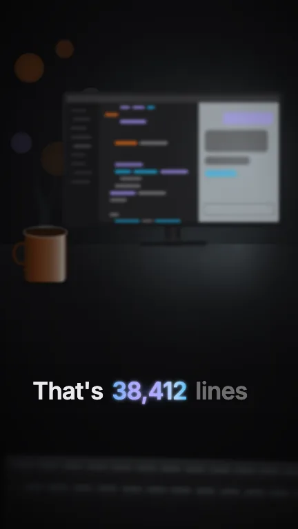
Draw the stand-in shot behind the captions: a shopping street in low golden-hour sun, walked down, soft-focus. It is only there so the boxes can be judged over real tone. Switch it off when you put the captions over your own video.
now: true
- Groundground · boolean
Paint a plain brand ground behind the captions when the stand-in is off. Off by default: with both off the captions render on a transparent background and drop straight onto your footage.
now: false
- Brandbrand · string
Brand token id, one of the keys of BRANDS. Sets the type colour and the accent, and the stand-in street's colours are all worked out from it.
now: beacon
For developers · source, dependencies and provenance
Dependencies
No Tailwind, no CSS, no asset files. Inline styles only.
Source
Provenance
Prompt
I film walking vlogs on my phone and I want my captions to look like the app's own text boxes: each line on a white rounded box with dark text, the boxes touching when there are two lines, and the box hugging the words instead of a fixed bar. I have an SRT from my transcription app, so paste that in and keep it in time with my voice, three to five words at a time. Underline the word I'm saying, put prices and place names in my brand blue, and keep everything clear of the like buttons and the caption at the bottom. When the next line comes up the box should resize smoothly, not jump.