Feed Testimonial Card
Social formatsA customer quote set as a magazine pull quote for a 4:5 feed ad, with a display-scale hanging quotation mark and a star rating that fills in one sweep
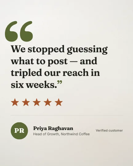
This is the format it was composed for. Switch above to see it lay itself out for another — same animation, re-arranged for the frame.
What you can change — 8 settings
Everything below can be changed without touching the animation. Hand the list to an agent, or edit the values at the bottom of the component file.
- Quote *quote · string
What the customer said, without quotation marks — the component sets those. Break the lines yourself with newlines: this is a pull quote, and the rag is a typographic decision nobody should hand to a text engine. Three to five short lines is the design. The type size is fitted to the LONGEST line and snapped to the library's scale, so two balanced lines of eighteen characters are set considerably larger than one of thirty-two and a stray long line quietly shrinks the whole quote.
now: We stopped guessing what to post — and tripled our reach …
- Ratingrating · number
Stars out of five. Halves and any other fraction are honoured — 4.5 fills four stars and half of the fifth, because the sweep is one continuous front rather than five separate icons. Set the number you can actually evidence; a flat 5 with a named person under it is the strongest thing in the frame and the easiest to lose credit for.
now: 5
- Name *name · string
Who said it, as they would sign it. Also the fallback for the monogram, which takes the first letter of the first and last words.
now: Priya Raghavan
- Rolerole · string
Their job and company on the quiet second line — 'Head of Growth, Northwind'. This is the half of the attribution that makes the quote worth anything, so prefer a real title to a category.
now: Head of Growth, Northwind Coffee
- Initialsinitials · string
One or two letters for the monogram disc. Empty derives them from the name. There is no photograph here and no way to add one: this registry ships no image files, so initials on a token-coloured circle are the honest avatar rather than the compromise.
- Sourcesource · string
Provenance, set small and right-aligned opposite the name — 'Verified purchase', 'G2 review', 'Customer since 2021'. Omit it and the attribution row runs left-flush with an open right side.
now: Verified customer
- Bottom reservebottomReserve · number
How much of the bottom edge to keep empty, as a percentage of frame height. In a 4:5 feed placement this is where the caption's first line and the call-to-action bar are drawn over the creative. Raise it if your placement carries a taller CTA; the whole composition lifts rather than the type shrinking.
now: 13
- Brandbrand · string
Brand token id — one of the keys of BRANDS. Written for `field`: warm paper, olive marks, a rust rating. `paper` and `press` set well too. The dark palettes are legible but turn a printed page into a screen, which is the opposite of what a testimonial is trying to borrow.
now: field
For developers — source, dependencies and provenance
Dependencies
No Tailwind, no CSS, no asset files. Inline styles only.
Source
Provenance
Prompt
A customer quote for a 4:5 feed ad, on warm paper. Set it like a pull quote in a magazine: an enormous serif quotation mark hung out into the left margin so the first line still lines up with the rest, and the quote itself big enough to read on a phone without leaning in — four short lines that I break myself. Under it a five-star rating that fills across in one continuous sweep rather than five stars popping in one at a time, then a hairline, then the person: their initials on an olive circle, their name and their job, and a small 'verified customer' on the right. No photograph. Keep everything inside the square crop the feed might take out of it, and leave the bottom clear for the caption and the call-to-action bar.