Feed Hook Card
Social formatsA 4:5 feed ad opener: the hook arrives arrested out of a scroll as one full-measure slab, then a marker rings the words that carry it
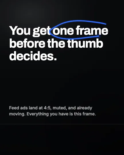
This is the format it was composed for. Switch above to see it lay itself out for another — same animation, re-arranged for the frame.
What you can change — 7 settings
Everything below can be changed without touching the animation. Hand the list to an agent, or edit the values at the bottom of the component file.
- Hookhook · string
The hook, set as large as it will go across the full width. Six to ten words is the shape this was cut for — enough to fill three lines of the measure, short enough to be read before it is scrolled past.
now: You get one frame before the thumb decides.
- Emphasisemphasis · string
The words the marker rings, written exactly as they appear in the hook. Two or three words; it is the claim, not the sentence. Leave it empty for a hook with no annotation on it.
now: one frame
- Supportsupport · string
The line that rests on the bottom safe line. It carries the reason, so write it as a sentence rather than as a tagline — this is the only body copy in the frame.
now: Feed ads land at 4:5, muted, and already moving. Everythi…
- Max linesmaxLines · number
How many lines the hook may take before the type shrinks to fit. Three fills the measure without crowding the pocket; two makes a much bigger, much shorter statement.
now: 3
- Caption percentcaptionPercent · number
How much of the bottom the caption and CTA row take, as a percentage of frame height. 20 is the number to keep: at 4:5 it puts the safe line exactly one frame-width down, where the frame stops being square.
now: 20
- Head percentheadPercent · number
How much of the top to keep clear, as a percentage of frame height. It covers the profile header on overlaying placements and the centre-crop that Stories and Reels take out of the same asset.
now: 13
- Brandbrand · string
Brand token id — one of the keys of BRANDS. The marker is drawn in that brand's accent and it is the only colour in the frame, so this is the whole palette decision.
now: signal
For developers — source, dependencies and provenance
Dependencies
No Tailwind, no CSS, no asset files. Inline styles only.
Source
Provenance
Prompt
Everything in this library is 16:9 or 9:16 and I buy Meta feed placements, which are 4:5. I need the opening frame of a paid feed ad: one hook line set as big as it will go across the full width, a supporting line, and one thing that actually moves so the thumb stops. Keep the bottom fifth clear — the caption and the CTA row land there — and keep the top clear too, because the same asset gets re-cropped for Reels out of the middle. Do not hug the left margin the way a Stories layout does; there is no action rail on the right in a feed, so use the whole measure. For the moving part: draw a marker ring around the two or three words that carry the hook, the way you would circle them on a printout, and have it still be visibly drawing rather than just appearing.