Vertical Timeline
DiagramsA chronology down a 9:16 frame on a continuous axis, drawn by a pen that leads the eye and measured against regular ticks
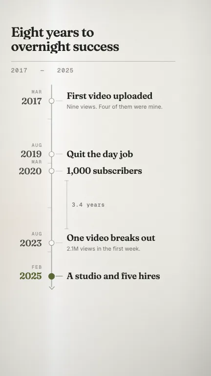
This is the format it was composed for. Switch above to see it lay itself out for another — same animation, re-arranged for the frame.
What you can change — 9 settings
Everything below can be changed without touching the animation. Hand the list to an agent, or edit the values at the bottom of the component file.
- Title *title · string
The chronology's title, top-left. Break it yourself with a newline — the lines are wiped on one after another, so break where you would break it by hand. Two lines is the design.
now: Eight years to overnight success
- Events *events · array
The dated nodes, earliest first. Four or five is the readable count in a vertical frame; six is the ceiling and it will start forcing the spacing even. Entries are sorted by `at` before they are laid out, so an out-of-order array still draws top-to-bottom in time.
now: 5 items
- Spacingspacing · "measured" | "even"
'measured' puts every node at its true position on a continuous axis, so the gaps carry meaning — this is the whole point of the component. 'even' distributes them at equal pitch, which is worth it only when the dates are ordinal rather than real ('Chapter 1..5'); it also hides the gradation ticks, because a regular ruler beside evenly-placed nodes would be a lie.
now: measured
- Gradationsgradations · boolean
Rule the left of the spine with regular ticks at a round interval picked from the span. They are what makes the irregular node spacing legible AS irregular — without a regular mark to measure against, uneven gaps just look like uneven layout.
now: true
- Intervalinterval · boolean
Annotate the longest gap in the chronology with a dimension line and the time it covers. This is the payoff of a measured axis — the quiet stretch where nothing happened is usually the story — so turn it off only when the events are evenly paced anyway.
now: true
- Interval unitintervalUnit · string
The unit the dimension line is written in, matching whatever `at` counts. 'years', 'months', 'days', 'km'. A trailing 's' is dropped automatically when the figure comes out at exactly one.
now: years
- Highlighthighlight · number
Zero-based index into `events` of the entry to emphasise — its node fills accent, its date turns accent and a ring opens off it once, as a second beat after the whole chronology is drawn. Defaults to the last entry, which for a 'how we got here' is almost always the right one.
now: 4
- Caption zonecaptionZone · number
Percent of the frame height reserved at the bottom for the platform's captions, title and sound credit. It is a real layout input here rather than a guide: the axis runs the full height of the frame, so this number is what decides how long the axis is and therefore how far apart the nodes can sit. 21 clears Shorts and Reels; raise it towards 28 for a long title or a pinned comment.
now: 21
- Brandbrand · string
Brand token id — one of the keys of BRANDS. Written for `field`: a chronology is a record, and a record belongs on warm paper rather than on a screen. `press` and `paper` also read as print. The dark palettes work — the ground and the sheen invert — but the frame stops being a page.
now: field
For developers — source, dependencies and provenance
Dependencies
No Tailwind, no CSS, no asset files. Inline styles only.
Source
Provenance
Prompt
I make video essays and I need a timeline for the vertical cut, which nothing in this library does. A spine down the left of the frame with the dates outboard of it and the events inboard, and the crucial thing is that the nodes must sit at their REAL positions in time — if nothing happened for three years I want to see three years of empty spine, not five evenly spaced rows. Put faint regular ticks down the side so you can tell the uneven gaps are deliberate, and label the longest gap with how long it actually was, like a dimension line on a drawing. Draw it with a pen that runs down the spine ahead of everything, and let each date and event get uncovered as the pen clears it rather than fading in. Warm paper, calm, and it has to keep out of the bottom fifth where the captions burn in and the right edge where the like and share column sits.