Comparison Bars
DataPaired horizontal bars per metric grow from one shared origin with a stagger down the table, figures counting at the bar ends
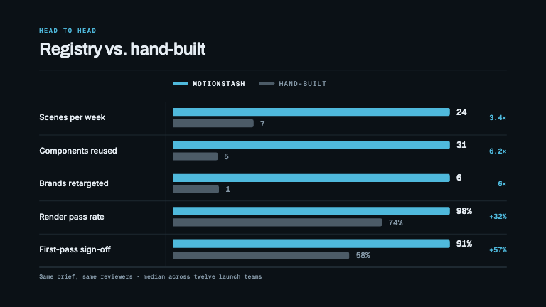
This is the format it was composed for. Switch above to see it lay itself out for another — same animation, re-arranged for the frame.
For developers — source, dependencies and provenance
Dependencies
No Tailwind, no CSS, no asset files. Inline styles only.
Source
Provenance
Prompt
An us-versus-them comparison, row by row. Each metric gets a pair of horizontal bars — the accent one and a muted one — growing from the left out of a single shared origin, staggered down the list, with the value counting up at the end of each bar as it grows. Row labels left-aligned in a fixed-width column so every bar starts on the same line, two legend chips at the top naming the series, hairline dividers under each row, and a right-hand column showing how big the gap is as a multiple or a percentage.