Vertical Versus Bars
DataTwo values grow as opposed blocks from one hard datum rule on paper, the winner landing last in solid accent with the loser's reach dashed across it
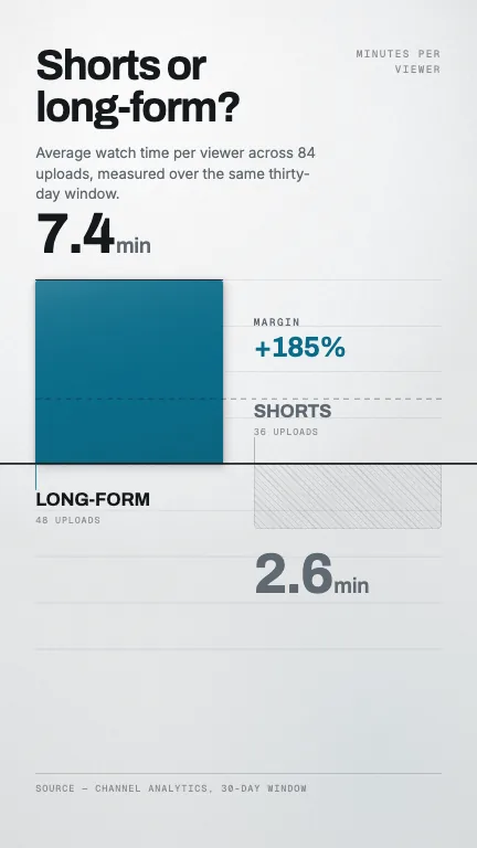
This is the format it was composed for. Switch above to see it lay itself out for another — same animation, re-arranged for the frame.
What you can change — 14 settings
Everything below can be changed without touching the animation. Hand the list to an agent, or edit the values at the bottom of the component file.
- Title *title · string
The question the chart answers, set large in the top-left. Use a newline to control the line break — the lines are revealed one after another, so break where you would break it by hand. Two lines is the design; three crowds the chart.
now: Shorts or long-form?
- Subheadsubhead · string
A sentence under the title saying what was measured and over what window. This is where the methodology goes, so the big figures do not have to carry it.
now: Average watch time per viewer across 84 uploads, measured…
- Unitunit · string
The unit of both figures, printed small in the top-right corner as chart furniture — 'MINUTES PER VIEWER', 'COST PER LEAD'. Omit when the suffix already says it.
now: Minutes per viewer
- Top *top · object
The side plotted in the left column, growing UPWARD from the datum. Position does not decide the winner: whichever side holds the larger value gets the solid accent block, the shadow and the last move.
now: object
- Bottom *bottom · object
The side plotted in the right column, growing DOWNWARD from the datum. Opposing the two directions across one line is what makes the lengths directly comparable at a glance.
now: object
- Prefixprefix · string
Set before both figures at a smaller size — a currency mark such as '$' or '€'. Shared, because the two sides are one measure.
- Suffixsuffix · string
Set after both figures at a smaller size — ' min', '%', 'k'. Rendered exactly as typed, so include a leading space yourself if the unit needs air.
now: min
- Decimalsdecimals · number
Decimal places on both figures. Use 1 for rates and durations, 0 for counts. The figures count up as their bars grow, so this also sets how the counter reads mid-move.
now: 1
- Margin calloutmarginCallout · boolean
After the winner lands, dash a hairline across the frame at the loser's length mirrored onto the winner's side, and annotate the overhang. This is the payoff of the opposed layout — turn it off only when the two values are close enough that the gap is not the story.
now: true
- Margin labelmarginLabel · string
Small monospace label above the gap figure. 'Margin', 'Ahead by', 'Difference'.
now: Margin
- Margin valuemarginValue · string
Overrides the computed gap. By default the callout reads the percentage the winner is ahead by; set this to phrase it your way — '2.8x', '+4.8 min', 'nearly triple'.
- Gridgrid · boolean
Rule the sheet with four hairline divisions either side of the datum. They give the eye something to measure against; drop them for a plainer, more editorial frame.
now: true
- Footnotefootnote · string
Source line along the bottom, under a hairline. Cite the measurement — an uncited comparison chart is a poster.
now: Source — channel analytics, 30-day window
- Brandbrand · string
Brand token id — one of the keys of BRANDS. This composition is built for the light palettes (paper, press, field): weight here comes from how dark a mark is, so on a dark brand the accent block stops being the heaviest thing in the frame.
now: paper
For developers — source, dependencies and provenance
Dependencies
No Tailwind, no CSS, no asset files. Inline styles only.
Source
Provenance
Prompt
A vertical 9:16 comparison for a light, printed-looking frame: two numbers face off as blocks growing in opposite directions from one hard black line across the middle of the sheet — one up, one down — so you can read which is bigger straight off the line. The one that wins should grow last, sit in solid colour and press onto the page with a real contact shadow, while the other stays a flat hatched tint printed into the paper. Once the winner lands, dash a hairline across the frame at the loser's level mirrored onto the winner's side and label the gap. It has to genuinely look like it was printed on paper, not like a dark chart with the colours inverted.