Series Part Badge
YouTubeA newsprint part marker for serialised Shorts — the part number set huge in the editorial serif over five segment marks, with the vermilion plate sliding into register
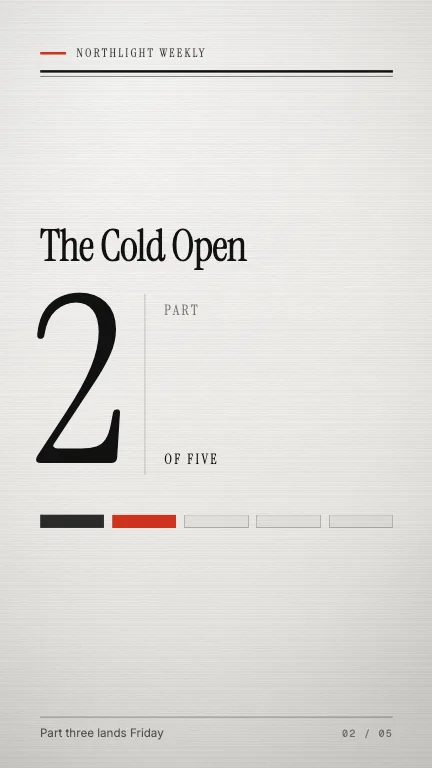
This is the format it was composed for. Switch above to see it lay itself out for another — same animation, re-arranged for the frame.
What you can change — 6 settings
Everything below can be changed without touching the animation. Hand the list to an agent, or edit the values at the bottom of the component file.
- Series *series · string
The series name, set above the number. Two to four words — it is the second-largest thing on the page and it wraps rather than shrinks.
now: The Cold Open
- Partpart · number
Which part this episode is. Sets the huge numeral and decides which of the segment marks inks in.
now: 2
- Totaltotal · number
How many parts the series runs to. Three to six reads best — past eight the marks get too thin to count at a glance.
now: 5
- Kickerkicker · string
The running head above the masthead rules — a channel or show name, not a sentence. Omit for a barer page.
now: Northlight Weekly
- Footnotefootnote · string
Foot of the page, opposite the folio. Best used to say when the next part lands.
now: Part three lands Friday
- Brandbrand · string
Brand token id — one of the keys of BRANDS. Written for `press`, whose editorial serif and newsprint palette are the whole point; `paper` and `field` hold up, the dark brands turn the page into a title card.
now: press
For developers — source, dependencies and provenance
Dependencies
No Tailwind, no CSS, no asset files. Inline styles only.
Source
Provenance
Prompt
I'm posting a five-part series as Shorts and I want the same card at the top of every one saying which part you're watching. Make it look like a printed page, not an app: the show name across the top under a masthead rule, the series title, then the part number set enormous in a serif with 'PART' and 'OF FIVE' small beside it. Underneath, five marks across the page — the parts already out inked black, the one you're on filling in red, the rest still empty. Off-white paper, black type, one red, and it should feel printed rather than faded in.